It’s far more than just what “looks nice”
Have you ever noticed how some websites make you feel calm, while others make you feel excited and keen to start a new adventure?
It turns out that a lot of your feelings are related to the colour theme of the website. And those feelings are no accident. In fact, big businesses spend epic amounts of money designing logos and colour themes to appeal to their target customers.
Your website’s colour theme is a key part of your visual branding. Whether your customers realise it consciously or not, the colours you use in your small business website influence how your customers feel about your brand. That’s because colours convey personality and meaning to your audience, which become part of your brand’s identity.
In this article we’ll give you the essential tips on choosing your own website design colour theme, and why it’s important to get your website colours right.
Keep your website colour theme simple
Keep the colour palette simple so your customers stay focused on the message of your website. Let’s face it, if your website uses so many colours that it looks like a unicorn vomited on the page, you’ve used too many colours.
Generally, a minimal colour palette of 2 to 4 main brand colours is enough. 1 or 2 colours for your logo, and 2 or 3 other colours sprinkled throughout your website as minimal highlights.
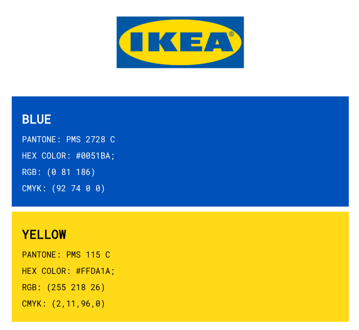
Here’s a familiar example. IKEA’s brand colours are yellow and blue (the same colours as the Swedish flag).
In addition to their two key colours, IKEA also uses pale blue backgrounds, and orange highlights to draw attention to new and sale items:
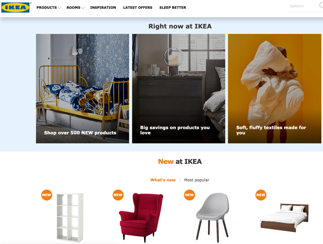
IKEA uses the standard blue colour for website icons.
![]()
It’s important to note that the secondary colours IKEA uses are related to the main colours. The orange is the opposite colour to blue in the colour wheel, and the pale blue is a lighter shade of the main blue colour.
With a minimal colour palette of yellow and blue, with orange and pale blue used sparingly, IKEA keeps their brand colours very tight and consistent.
Create a mood board and colour palette
You probably already have a company logo, using 1 to 3 colours. These colours should be your main website colour theme, and you can add a very select few more colours as secondary highlights throughout your website.
If your logo is a single colour and you need inspiration to find suitable secondary colours, find an image that includes your main logo colour and also captures the essence and personality of your brand. The image can be one of your own brand’s images of a product or lifestyle photo. Or the image can be from anything else that captures the personality and tone of your brand, to use as colour inspiration.
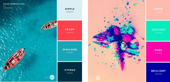
You can use a colour picking tool such as this Eye Dropper Chrome extension, which can capture any colour from any image on the internet. Simply place the colour dropper over the colour you like, and select it. The dropper will tell you the internet Hex code (#) of that exact colour. With the hex colours, you can create a colour palette from the image, like these ones below, from Canva:
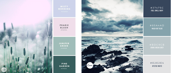
When you create your website design, focus your images and font colours on the colours in your palette. Use pale colours for backgrounds, and bolder or darker colours for heading text and banners.
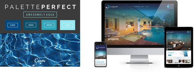
For example, here’s a colour theme of watery blues, and how the colour palette can play out in a website design:
Don’t be afraid of bright or contrasting colours, either (hey, it works for IKEA!). You can go bold, as long as the colours work together, and you’re consistent in how you use the colours across your website design.
By focusing on white space and plain backgrounds, you can use bright pops of colour in banners, headings, menus, icons and buttons.
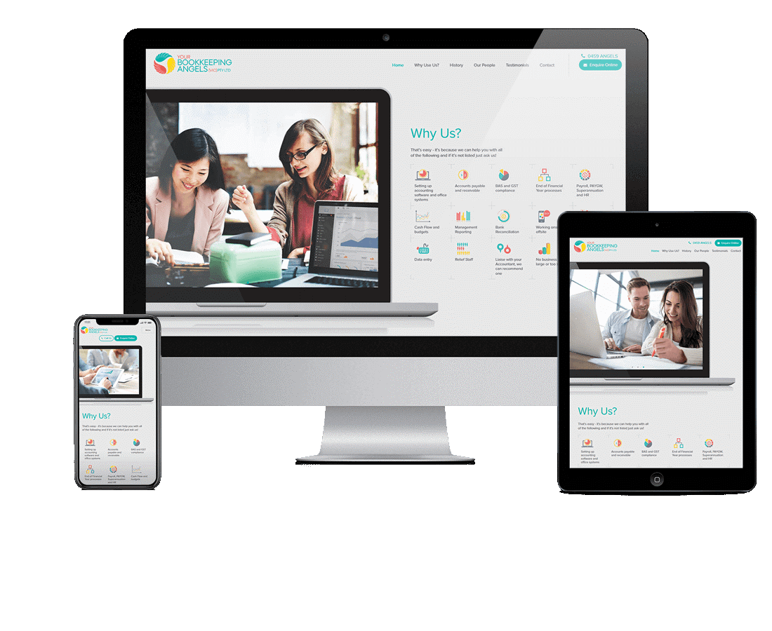
For example, this bookkeeping website’s colour theme uses three bright brand colours: aqua, red and yellow, but it uses them sparingly, so they’re not overwhelming.
Understand colour psychology
As part of the process of choosing your website colours, it helps to know a bit about colour psychology.
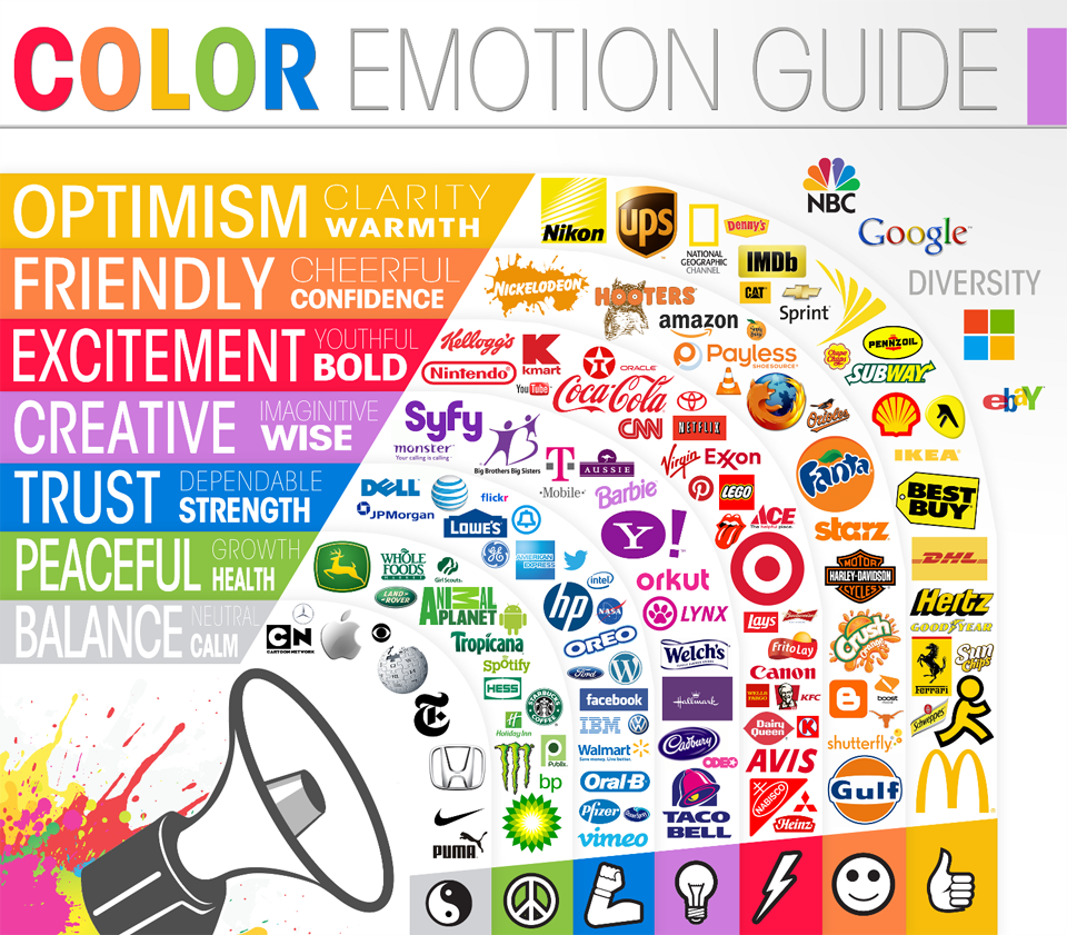
This handy colour emotion guide from Medium shows how household brands use specific colours to convey the personality of their brand. The colours play a part in telling the customer how they should feel when thinking about the brand and using the product.
Yellow – optimism, clarity and warmth
Yellow – optimism, clarity and warmth
Orange – friendly, cheerful, confidence
Red – excitement, youthful, bold
Purple – creative, imaginative, wise
Blue – trust, dependable, strength
Green – peaceful, growth, health
Grey – balance, neutral, calm
Most of the time, customers aren’t aware of their emotions being affected by colours. But here’s how it works on a subconscious level. If you want your customers to feel reassured when they’re buying a product from you online, choose a calm colour for your call to action buttons.
Which of these buttons make you feel like the choice you’re making is an easy and safe choice, and which one makes you feel nervous?

Your customers probably aren’t aware of how the button’s colour makes them feel. But colour psychology tells us that more customers are likely to confidently click on the blue button than the red, especially if the purchase is a big financial commitment.
In fact, if you wanted to know for sure that you’ve chosen the right colour, you could conduct an A/B test. This is a test where you create two versions of a web page, show each version to exactly half of your website visitors, and test which version brings in the most sales. Typically, the pages would be identical except for the element that you want to test.
In this example, you’d use the same images and text on the web page, but you’d test different button colours to find out which button colour is more appealing to your customers, and therefore which button colour helps you achieve more sales.
Check for usability in your colour theme
There’s no point making a website that looks beautiful, but that is unusable by your customers.
Soft pastel colours usually don’t work well for headings or body text because they’re too pale to read on screen. As you can see, pale pink text on a white background is very hard to read.So if pale pink is one of your key brand colours, use it as a background colour, button colour or image filter colour, rather than a text colour.
Colours that are very similar to each other, such as blues and greens, are very difficult for people to tell apart, especially if they are colour blind or partially colour blind. Likewise, colours that don’t contrast should be kept apart.
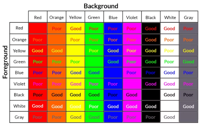
For example, white text on a yellow background is virtually unreadable (even for people with good eyesight and no issues with colours). But black text on a yellow background has high contrast, and is easier to read.

Here’s a useful chart showing which colours work well as text over other coloured backgrounds, from this article on Lifewire.
Before you commit to a colour theme for your website, do a reality check.
Mock up a simple page including your proposed colours for backgrounds, headings, text, buttons, and text over images, to check that it works well.
It’s important to make sure that your customers will be able to navigate through your website without getting frustrated. In fact, when you consider website usability as a critical part of your colour theme, you’ll increase your conversion rate. The simple explanation is that if a website is hard to use, your customers will give up and shop elsewhere, and that’s a lost sale for you.
More than just a pretty palette
With careful consideration about brand colours that appeal to your target customers, you’ll be able to create a website colour theme that both looks beautiful and makes your customers want to buy from you.
When you’re ready to get started on your new professional website (with a carefully curated website colour palette from our experienced graphic design team), get in touch with our affordable website design experts on 1300 367 009.


